10 Ways to Represent Information and How to Make the Most of Them
At school, you don’t often get the opportunity to choose the format in which you answer a question.
You’ll usually be told whether you should be answering a question in the form of an essay, a presentation, or more rarely something more creative like a poster. But that means on the rare occasions when you do have to choose the format for an answer yourself, you may not know where to start, and might end up falling back on the same boring staples as the rest of your class.
Yet there are lots of different ways to represent information, and they each have their advantages and disadvantages for different purposes. Let’s say you’ve been asked to discuss female superheroes in the 21st century through whatever format you choose. Here are the options, and what each one is best suited for.
1. Essays
You’ve probably written so many essays that you’ve never really thought of them as just one possible way of conveying information. An essay is an extended piece of writing that follows an established structure: an introduction that outlines the argument that will be made, a series of paragraphs that expand on that argument, and a conclusion that sums it all up. And that definition contains the essence of an essay: they are structured around a central argument, so if you don’t have a point to make then they’re the wrong choice.
If your title is “To what extent is Wonder Woman a feminist film?” then an essay is a good option. But an essay won’t work for a purely descriptive title like “Notable female superheroes of the 21st century”. Essays should address a complex argument, where good points could be made on either side. The title can be a yes or no question (“did 2004’s Catwoman doom female superheroes at the box office?”) and you can come down on one side or the other, but you should acknowledge and discuss different perspectives while putting forward your own point of view.
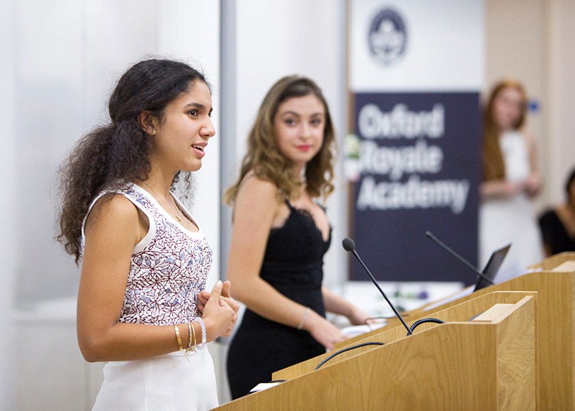
2. Presentations
We’ve all sat through boring presentations – like the ones where there are paragraphs of text on each slide, and the speaker stands there reading them out as if you couldn’t read them for yourself. Bad presentations are normally a result of people choosing to give a presentation when they should have given a speech, written an essay, or created a poster. A presentation offers you the chance to combine images with short amount of text and your own spoken explanations; if you don’t need images, or you don’t need a spoken explanation, then a presentation is probably the wrong choice and your attempts to illustrate or explain will come across as forced.
But if you do have images that benefit from being explained at greater length than you can manage on paper, or if your speech really needs illustration to make sense, then a presentation could be the right choice. For instance, if you’re talking about Harley Quinn’s costume design, being able to play short clips from Suicide Squad or include costume design images could be very helpful to your audience. The other bonus of presentations is that they are interactive as your audience can ask questions as you go along, or at the end, which can be handy for particularly complex subjects.
3. Articles
Essays aren’t the only way of presenting information in a long-form, written way, even though they’re usually the only option open to you at school. You can allow yourself a lot more flexibility by instead writing an article – that’s in the newspaper or magazine sense, rather than the academic sense. An article can be any length from a couple of hundred words to the exhausting 10,000 pieces that you might read in the New York Times. You can promote a definite point of view, write something purely descriptive, or describe the various ideas in a space without coming to any definite point of view.
That’s not to say that articles have no rules at all. You can’t use academic conventions such as footnotes. In general, articles are more focused on you as the writer than an impersonal essay in which you can’t use the word “I”. They are less formal than essays, but you should still stick to a single theme, be concise and avoid waffle. If you’re writing an article as a cheat’s way out of writing an essay, it’s probably not going to be very good.
4. Infographics
Is the information you have to convey primarily visual? And does it really need that much explanation? If not, consider using an infographic – one of the quickest ways to convey a small amount of information in an easily comprehensible way (assuming you have the necessarily design skills, of course).
An infographic would be a great way to convey a list of the different ways superhero films have changed in the 21st century – for instance, in colour scheme, soundtrack and length. But the information you’re conveying does need to be relatively limited, without the need for too many words – more than a hundred and you probably shouldn’t be using an infographic. It should also be comprehensible at a glance. An infographic is a means of conveying facts rather than making complex arguments, so don’t create one hoping that your readers will infer anything below the surface of the facts you’ve included.
5. Comics
Comics such as XKCD on password strength or the difficulties of ordering comments on a website, or the Pencilsword on equality of opportunity all explain relatively complicated concepts – that you could easily write an essay on – in a way that you can read in less than five minutes. The two XKCD examples are almost more like infographics than conventional comics that use the progression of panels to tell a story, demonstrating the flexibility of the medium.
That said, many explanatory comics try to force the explanation into the medium. You might have encountered comics that are just a character in each panel giving a speech with different gestures to imply tone of voice. Take this comic on self-care – the amount of text significantly outweighs the images, which add very little to the reader’s understanding. One tip is that if you can write the text for the comic and it’ll still make as much sense without the images, a comic is probably not the best choice for the information you want to convey. But for anything that involves both images and telling a story – for instance, showing the parallels between different plots of superhero films – a comic could be spot on.
6. Videos
Making a good video is surprisingly straightforward. You can film yourself, or something relating to your subject, at a reasonable quality with the camera on your phone and a selfie stick; there are also some selfie sticks specifically designed to help you get a wobble-free video. If you want to create something even simpler, such as a video that consists of images with captions and music, there are plenty of suitable free video editors available.
Video is a particularly good medium if you’d like to include other video footage – for instance, if you’re showing a clip from a film, possibly with yourself talking over the footage to provide commentary. There’s no point in making a video that’s just you talking to camera, especially if you’re going to be presenting it standing next to it, watching yourself talk. Videos allow you to combine lots of different types of still and moving images along with explanations; the average person speaks at between 110 and 150 words per minute, so you can get through a lot of explanation quickly in video form, using tone of voice and emphasis to make your meaning clearer.
7. Speeches
All ways of representing information depend on your own abilities. But while you can edit an essay until it flows well and use the content of your slides to fall back on when giving a presentation, giving a speech can involve a lot more pressure as it really does depend on your own abilities at the point when you’re called upon to speak.
But if you can speak well, this can be a very effective way of conveying information. It’s not just out of tradition that politicians give speeches rather than sending out infographics or making PowerPoint presentations when they want to persuade people to vote for them. People respond best to other people; while they might not be swayed by the words of your speech written down on the page, the act of engaging with you as an audience while you speak them can make all the difference.
Speeches are best reserved for simple points (e.g. stories of female superheroes are inspiring to women) rather than complex explanations. They’re a medium for persuasion more than information, so any facts you present should be easily memorable. Anecdotes can also be very effective.
8. Reports
If you don’t want to present an argument in essay form, but an article seems too informal for your topic or style, then you might want to consider writing a report. For instance, if you want to provide information on the commercial success of Captain Marvel comics, then a report might be the ideal form to present it. Reports combine explanatory text with images and graphics such as charts, tables and graphs where appropriate. You should aim to be concise – reports should not use extraneous text – but you have the freedom to write paragraphs of explanation in a report, either supported by or to elucidate the graphics you’re using, in a way that you would, for instance, in an infographic.
It’s arguable that the medium to which a report is closest is in fact a presentation in the way that it combines text with other supporting material. The key advantage of reports over presentations is that they allow you to go into much more detail as the reader can scrutinise them at their own pace, rather than the pace being dictated by your presenting speed.
9. Posters
Posters can convey a variety of different types of information. There’s the kind of poster that provides simple information in a clear and obvious way – “put your litter in the bin” with a big photo of a bin, or “walkway may be slippy when wet” with a drawing of someone falling over. Then there are posters that work on the same principle but convey more information, such as a map with images of places and a short blurb about each of them (there’s some crossover with infographics here). At the other extreme from the simple posters, there are posters for scientific conference (usually looking something like this) that tell you very little at a glance, but nonetheless serve to convey complex information quickly.
A poster is a good choice if you’re not sure how long your audience will be prepared to engage with you for, and you want them to learn something from you even if they don’t choose to stick around. A scientific poster is not too different from a report, just on a larger piece of paper, but the crucial part is that someone can look at a poster and pick up your topic in the middle, then walk away, which is less likely with a report.
10. Leaflets
Leaflets are another medium that combine explanatory text with supporting graphics, but for less complex information and a lesser amount of detail than a report or even a poster in the scientific style.
There are different styles of leaflet for different purposes – for instance, a book-shaped leaflet encourages the reader to read in a particular direction, namely the order in which books are read (so in English, from left to right), while a gate-fold leaflet can provide basic information on the outside and then unfold to provide additional detail. In this way, you can use your choice of leaflet to structure the way in which your reader engages with the information provided in a more elaborate way than an article or report. A leaflet should be short, simple and attractive, making them a good choice if your graphic design skills are stronger than your writing skills.